Whilst working at Wiggle / CRC, I worked on a number of projects, user testing and designing pages and concepts.
I worked on both mobile and web pages for Wiggle and Chain Reaction Cycles (CRC) on the home pages, listing pages, content page, basket pages and the checkout.
Below are few examples of what I was doing at Wiggle.
User testing work
I was involved in user testing for the redesign of the Wiggle site which is due to go live sometime in 2023.
An example of this is the testing of a typical user journey on the site. Customers were asked to find a particular item of interest to them during a moderated remote interview. As the customer went from the discovery through to adding the item to their basket, they were asked to think aloud.
The notes taken from the interviews were placed on a chart, representing the satisfaction of the customer vs the functionality of the sites.

Some of the functions of the sites were also measured by considering whether it should be a ‘must have’ – almost invisible by nature, and functionality that pleased the customer – made them say ‘Wow!’
What we were looking for on this chart were issues that needed attention, represented by clusters of similar comments mostly in the lower quadrant.
These items were then prioritised in the workflow.
Design work
As part of a basket enhancement project, I worked on the screens to confirm removing an item from the basket, giving the customer a pause for thought on whether they really wanted the item or not and giving them the opportunity to change their mind or add it to the ‘Wish list’ for later.

On removal of the item, a reminder of that item is left in the basket list until they leave the page. This enables them to still be aware of it and by clicking on the ‘ghost’ item, add it to the basket once more.
Another area I worked on was the card details page. On the site there are various places that a customer could add a bank card (at the checkout, in the customers’ profile pages, etc). All these instances were inconsistent and needed an overhaul.

I worked through some designs ensuring that the details required were in the same order as they are printed on the card – card number, expiry date, name of card holder, etc. Input fields visually indicated what was required, e.g. credit card fields were designed to be the length of the card number. The card number would be automatically formatted so that it showed in blocks of four digits. The first four digits would identify the card type and a logo would appear on the right of that card sort. Expiry dates were in the format that were printed on the card, etc.

I also worked on a concept for a one-stop checkout page, where a new or returning customer could fill in all the details needed on one page in the checkout procedure.
This is particularly important for a returning customer, as they would have everything already filled out and only have to press the pay now CTA if they didn’t need to change any details.

Chain Reaction Cycles work
I worked for Chain Reaction Cycles (CRC) in a similar capacity, updating pages, user experience improvements and tests and updates to the basket and checkout pages.
Redesigning the content pages was a great chance to engage in some creative design too.
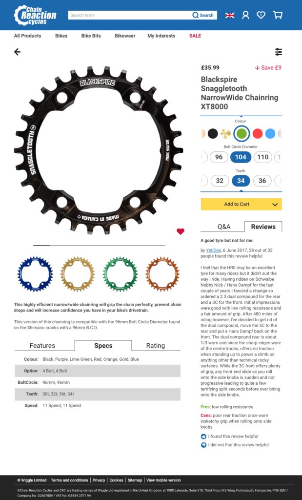
This design featured new ideas for the SKU selector – a sideways scroller for each option – which meant it worked seamlessly on mobile devices too.
I utilised the otherwise relatively unused right hand column of the page too, adding the Q&A and Reviews section. User testing the live page had shown that customers found particularly the review section useful in making a purchase and this design meant that the reviews were in the same area as the ‘Add to Cart’ CTA.
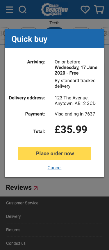
Another new feature was the ‘Add to Cart’ sub-menu incorporating a ‘Quick Buy’ button, shown below on the mobile version.
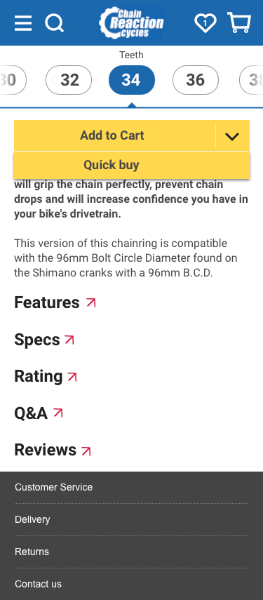
This meant that if you were a logged in returning customer with your account all set up, all you had to do was click ‘Quick Buy’ and review the details to complete the order.
More information
For more information on details about my work at Wiggle and CRC, please contact me.